Awake early, the day after thanksgiving I have nothing better to do than enjoy my coffee and ruminate about art, inspiration, composition, good stuff like that:) I'm visiting family in Pensacola, which is a 12 hour car trip from Cincinnati, so the bulk of my art materials are in my studio at home. However, I managed to pack a sketch pad and pencils, just in case. This was meant to be a quick turnaround, but my Mom is elderly. A few more days here won't hurt. Anyway, it forces me to step out of my get-er-done routine at home and breath. Later I might walk down to  the end of Mom's street with my sketchpad and sketch a pelican or shrimp boat. That is, if I feel like it.
Composition, composition, composition!
The question of all questions: What makes good composition? How does one crop, punch color, add or delete elements in order to create a piece of art that will resonate? There are rules to composition, which I rarely think about at first. If a ref photo grabs my attention, there is probably something there worth trying. Later, as I start the project, I will think about rules, where to crop and so forth, but I have to be careful to not sterilize the inspiration right out. That initial reaction, the one that made me stop and look, what was that and how will it translate? Over the years, I've paid attention to how my art is received and learned from that. What draws the most attention? Rarely do I hear "I love this because it is so well executed." More often it's "I love that red," or "wow, it looks like a photo (which drives me crazy by the way. Why would anyone spend 6o hours of her life to simply copy a perfectly good photo?)
To break it down: color,value and a relatable story, are the three main elements to a successful image. Detail is used to support the theme not drive it. For instance, if you have ever watched the reality t.v. show THE VOICE, how often is the vocal run used to show off vocal ability? But if it is delivered without conviction and you can't hear the lyrics, it's just noise. In two dimensional art, if one does not manage to draw the viewer in with substance, what use are the details? On the other hand, taking the time and effort to render those details well, honors the idea. Don't skimp.
This is a very long blog entry. I imagine you are wondering what it has to do with this landscape photo. Simply put, the photo reaches into my soul. It is beautiful. The colors are rich, the shapes interesting and there is nice contrast. The message is simple. It calms me. I want to live in this image, where the only human touch is the evenly mowed field.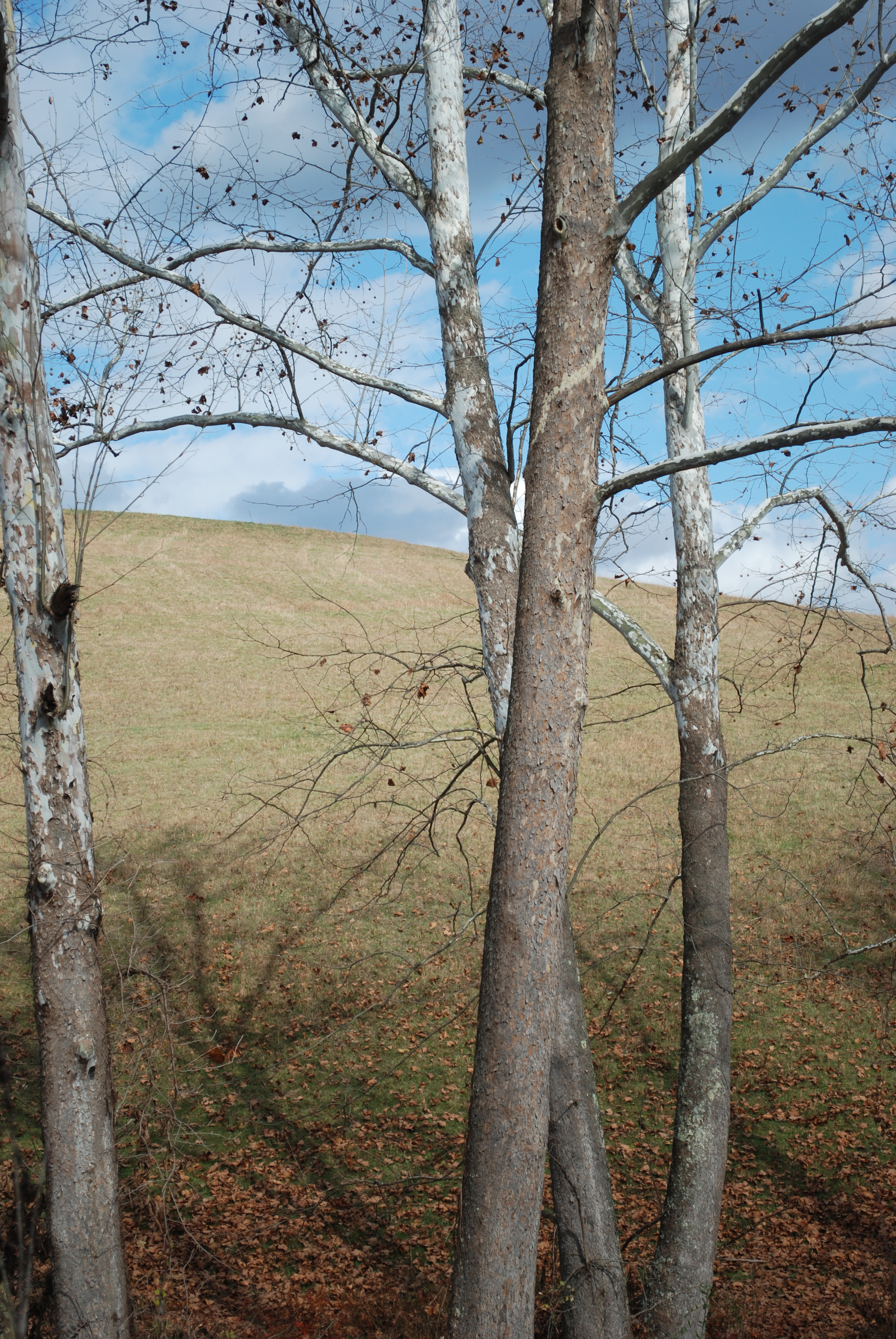
Another Stonelick Bridge what?
OK, you heard all my whining and complaining over my first covered bridge painting: how I shouldn't of done this- should've of done that, yadda-yadda! You will be shocked to know, that not only did it sell, but a photo of the finished piece on my cell phone, managed to procure a custom ordered rerun. This time, fall or winter and more than twice the size. Am I nuts? There is much to be said about the value of iconic scenery. Lets see if this time I will remember to do what I should do and leave off doing what I shouldn't.
Periwinkles Pileup
When I was a small child visiting my grandparents at their seaside cottage, I spent many happy hours exploring the rocks that reached like fingers into the ocean. Those rocks held cupped in their crevices, the coming and goings of magical things. See the Hermit Crab dragging its stolen home, bumping and scraping across the rock floor, while glinting black mussels, periwinkles and barnacles occupy their own rock real-estate. A flash of movement as a baby crab with antenna eyes darts sideways to hide in a clump of seaweed. Shadows play and water sparkles as waterbugs and dragon flies skitter across the surface. I have never lost my my fascination for these places. Have you ever walked along a Maine shore line to see millions of periwinkles piled up along the tide mark? Periwinkle Pileup is a "child's" closeup view, its diminutive size only 4.5"X 9.25" It is painted with Prismacolor, Luminance, Derwent and Soho colored pencils with the occasional brush of spirits on linen mat.
Periwinkles and more periwinkles!
Happily sold!
Anubis is signed
 Looking through reference material, I came across a series of photos taken in Cape May New Jersey and immediately thought "scale of justice." The scale is associated with Anubis. The idea of a guardian protector of the dead, who by weighing the heart, determined a soul worthy of Heaven or Hell, originated with the Egyptians and was later adopted by the Greeks, who named the God Anubis.
In this image, two helmet-shaped, Horseshoe Crabs, deemed to be living fossils and estimated to be 450 million years old are held at arm's length by the beautiful yet indifferent young woman, who hides her slight amusement behind dark glasses. The white dress reminds us that our fate is yet to be determined.
Anubis is painted /drawn with Prismacolor pencil French Grays 10%-90%, black Verithin and some solvents. It measures roughly 39.5x 36". The photograph shows up blue at the bottom. This is some kind of reflection that I haven't figured out how to omit. Stay tuned.....
Latest Work
This latest drawing -painting uses all my technical tricks to tell a story. You will notice the rich color and texture of the red coat in contrast with the barely there background. It is 27"x20" colored pencil on rag mat board. I haven't decided on the title. For now I'm calling it "On The Bridge" It was conceived while visiting The Brooklyn Bridge last November. I came upon this scene and found it interesting. The bridge itself is an amazing place to visit- all those cables slicing patterns through the New york sky. But it was the gush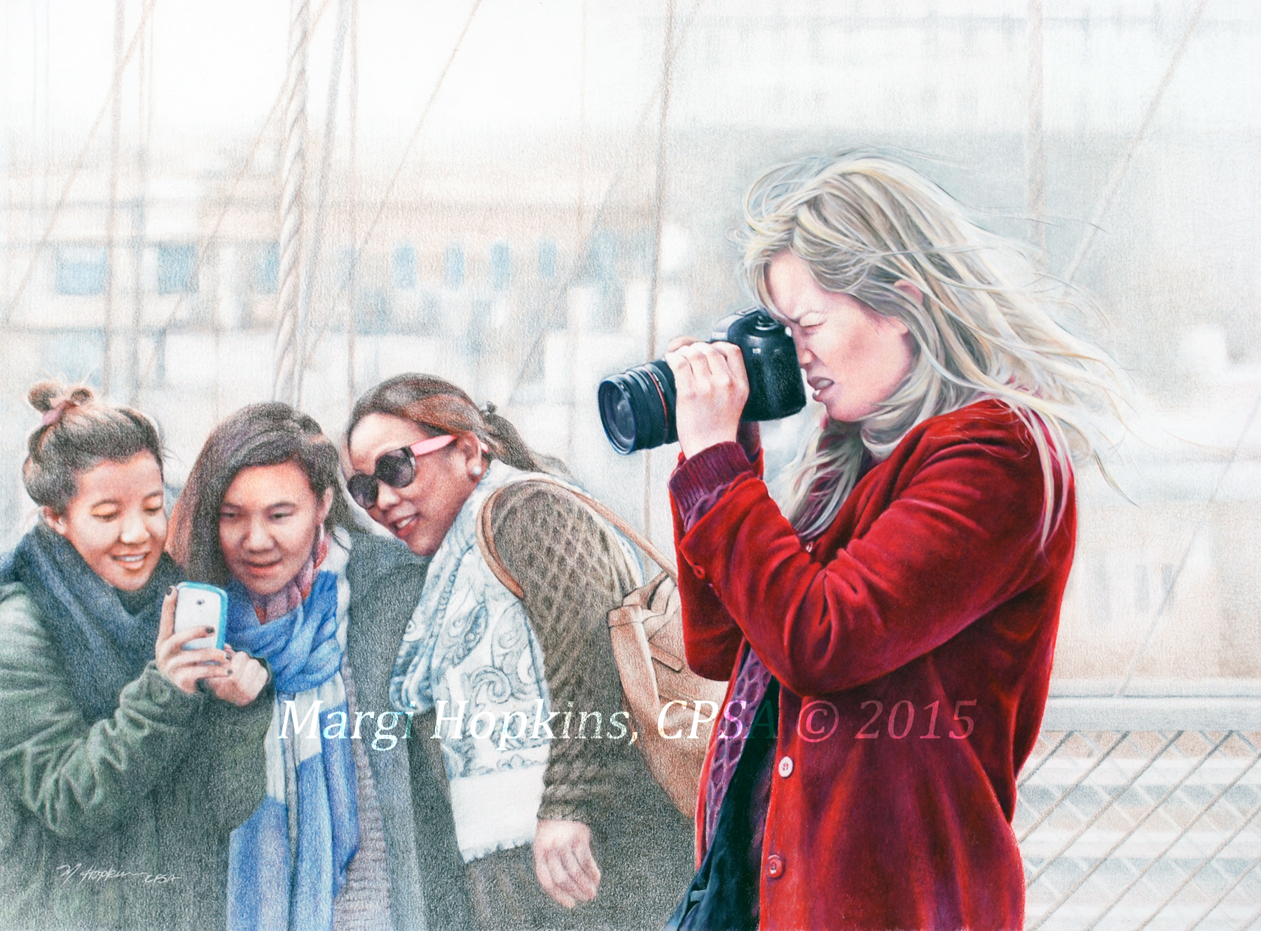 of human traffic over the bridge, people from all over the world, some commuting, some tourists, some on foot, some on bikes, I found most fascinating.
In this scene you have the juxtaposition of three self absorbed young girls taking a group shot with a smart phone, while a serious young woman photographs scenery with her SLR and zoom lens. The progression of technology- what is gained what is lost? The three girls capture three faces, together in the place, in the moment, while the more mature woman takes photos of what is beyond.
In addition, I like the humor in this scene. You have me taking a reference photo of a young woman taking a photo in front of three younger women taking a group selfie, all of us standing on the same bridge seeing completely different things!
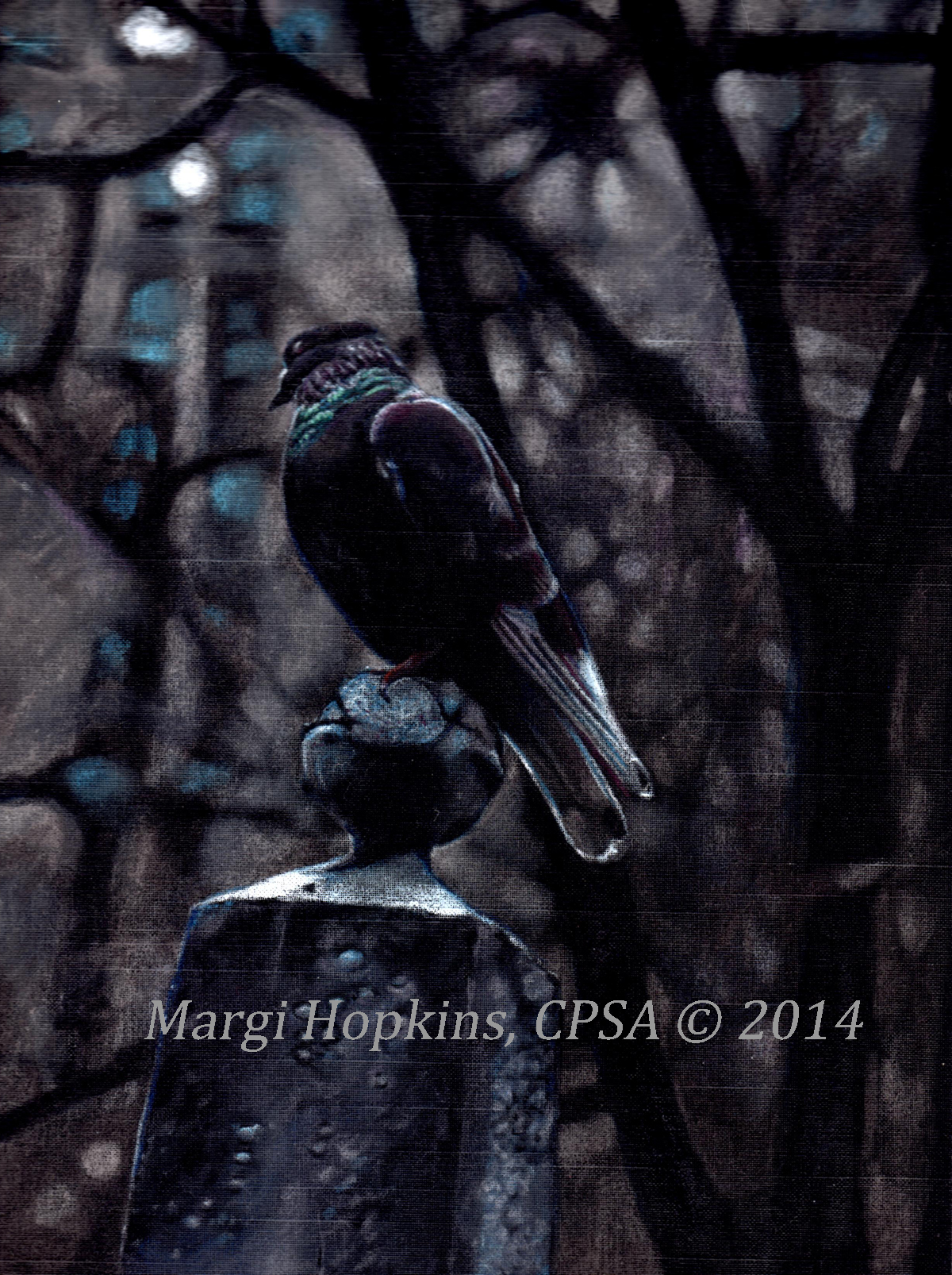
Pigeon Trinity #2
 This is the second of three I intend to use in a triptych of creepy grave stones and pigeons. The references were taken with the last of the afternoon light, Trinity church in NYC. These are painted with colored pencils on linen which makes glare a problem. Hopefully I will be able to iron out the photography kinks once finished with all three.
