The question of all questions: What makes good composition? How does one crop, punch color, add or delete elements in order to create a piece of art that will resonate? There are rules to composition, which I rarely think about at first. If a ref photo grabs my attention, there is probably something there worth trying. Later, as I start the project, I will think about rules, where to crop and so forth, but I have to be careful to not sterilize the inspiration right out. That initial reaction, the one that made me stop and look, what was that and how will it translate? Over the years, I've paid attention to how my art is received and learned from that. What draws the most attention? Rarely do I hear "I love this because it is so well executed." More often it's "I love that red," or "wow, it looks like a photo (which drives me crazy by the way. Why would anyone spend 6o hours of her life to simply copy a perfectly good photo?)
To break it down: color,value and a relatable story, are the three main elements to a successful image. Detail is used to support the theme not drive it. For instance, if you have ever watched the reality t.v. show THE VOICE, how often is the vocal run used to show off vocal ability? But if it is delivered without conviction and you can't hear the lyrics, it's just noise. In two dimensional art, if one does not manage to draw the viewer in with substance, what use are the details? On the other hand, taking the time and effort to render those details well, honors the idea. Don't skimp.
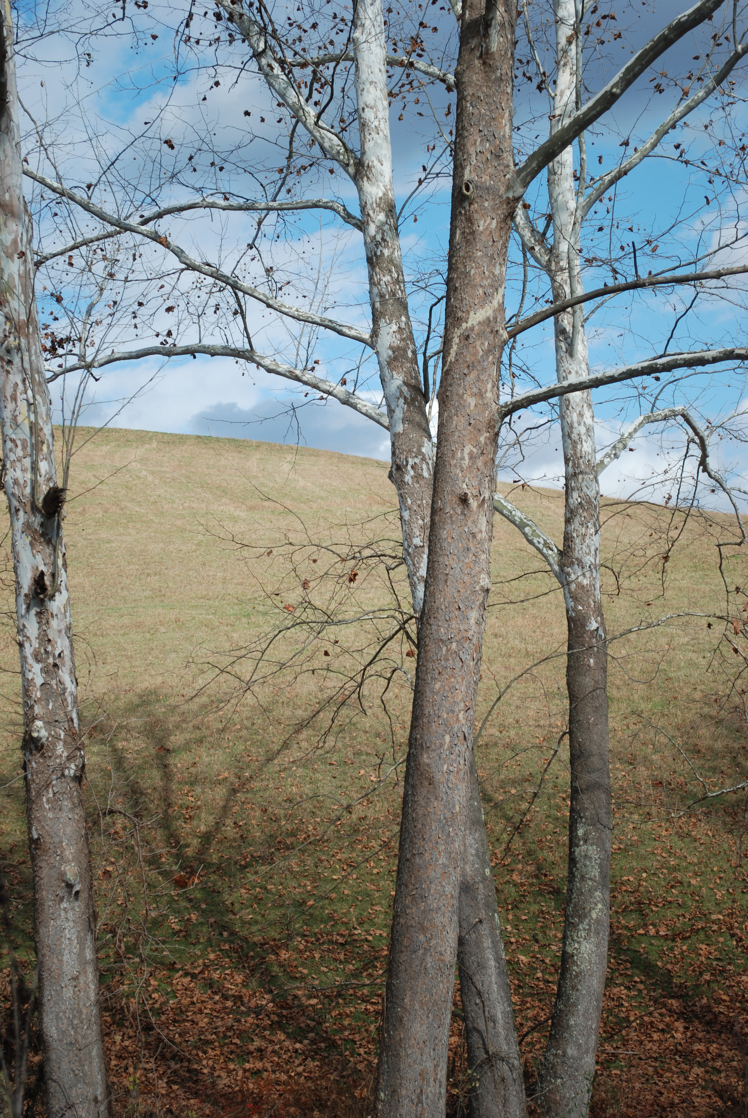
This is a very long blog entry. I imagine you are wondering what it has to do with this landscape photo. Simply put, the photo reaches into my soul. It is beautiful. The colors are rich, the shapes interesting and there is nice contrast. The message is simple. It calms me. I want to live in this image, where the only human touch is the evenly mowed field.
